e-commerce
I worked in EyeEm for 2+ years, contributing on the brower-based platform, owning the Webflow account and helping with the recruitment of new designers to build a new Product Design Team.
Product Designer
Berlin, Hybrid
2021 - 2023
About EyeEm
EyeEm is as a photography community and marketplace that facilitates connections between creators and prominent brands to source original and on-brand content.
My role at EyeEm
During my role at EyeEm I was one of Designers inside the Product team, specifically collaborating on the maintenance of the browser-based application.
How we worked
Our Product Design team collaborated closely with project managers, data analysts, and developers. We worked together on the continuos development of the platform and set up regular meetings and feedback sessions.
For the redesign of the Cart & Checkout process, we analyzed data reports, identified pain points, elaborated hypothesis and proposed improvements. This included addressing UX improvements on the cart dropdown feature, background color inconsistencies, premature tax calculations, and issues with SSO implementation for logged-out users. We also collaborated with the legal team to ensure compliance with changes like pre-saving billing information and payment details.

Identifying Data take-aways and UI pain points on the Cart & Checkout flow

Screenshot from the user flow analysis in Figma
UX Exploration
Cart Page

Top Navigation
The Cart page lacked EyeEm’s familiar top navigation, which could make users feel as though they’d left our site, potentially impacting trust. We hypothesized that reintroducing the top navigation might improve user confidence and retention.
VAT Calculations
VAT calculations were appearing too early in the cart flow. As users added more items, the displayed total rose significantly, which might discourage them. We considered moving VAT calculations closer to the payment step to present a more approachable total earlier in the process.
Dark Theme vs. Light Theme
Based on research, we applied EyeEm’s dark theme to the Cart Page, along with the top navigation, to maintain visual consistency and keep users feeling connected to the platform. A light theme at this stage could have disrupted the flow, making users feel like they were leaving the page.
Introducing more payment methods: Long term goals
To enhance convenience, we considered adding more one-click payment options, such as PayPal, Apple Pay and Google Pay, in future iterations.


Authentication for logged out users

Authentication Modal
To create a more seamless experience, we moved authentication to a modal, allowing users to keep their Cart in view while logging in or signing up.
UX writing
To keep users engaged, we explored updating our UX copy with clearer instructions, gently reminding users they were in the middle of a purchase.
Guest Checkout: Long-term goals
We also discussed the potential for a Guest Checkout, allowing users to skip authentication until later stages. While this feature wasn’t implemented in this iteration, it remains a consideration for the future.


Checkout Page

Cart Preview & Buy Now button
Previously, the “Buy Now” action was hidden in the second step and often inaccessible with longer Cart lists. We standardized the Cart preview by grouping items by license type, which kept the “Buy Now” option in view, encouraging quicker decision-making.
Transfer Licensing
Many of our users—often designers or agencies buying for clients—needed an option to transfer licensing directly to their clients. Previously, they had to call Support to complete this transaction. By adding this feature to the redesign, we streamlined the process and responded to a frequent user need.
Pre-save payment and billing information: Long term goals
To streamline the purchase process, we considered pre-saving user data, such as cart details and billing information. However, due to capacity and alignment with the legal team, we decided to prioritize this feature for future iterations


Thank you Page

Dark Theme Consistency
To maintain a cohesive user experience, we applied EyeEm’s dark theme to the Thank You page as well. This ensured visual continuity throughout the checkout journey, reinforcing a sense of familiarity and completion. Introducing a light theme at this final stage could have disrupted the flow and made the experience feel disconnected from the rest of the platform.


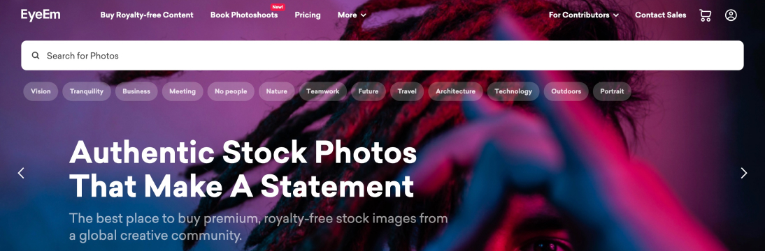
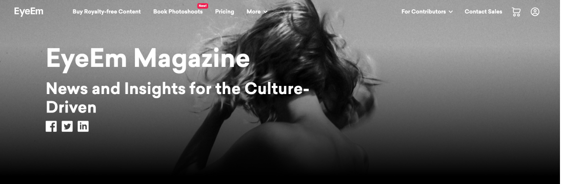
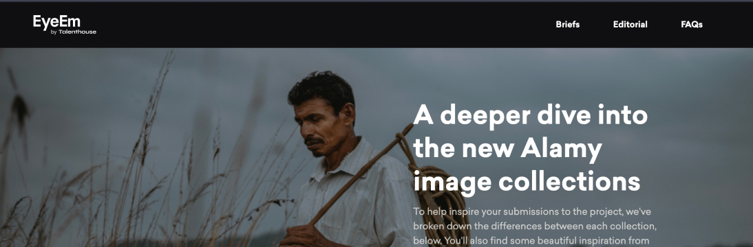
EyeEm’s Web presence
EyeEm.com combines the flexibility of Webflow with the capabilities of front-end development, giving designers complete control over the UI and behavior of some areas of the website. I maintained various site areas and frequently launched landing pages for marketing campaigns, collaborating with the Marketing and Innovation teams. I was responsible for ideation, design, implementation, and final release of these projects.
Here are some live examples: